Title: Graphic design for the sake of public awareness, not to sell socks.
Introduction
Before we get to the real topic of this presentation,
What do people think first when it comes to graphic design(ers)?
- People who are good at computer and software (computer art)
- A Tool to commercialize something (a product) for profit
- Makes something look nice (aesthetics)
I would say above are ALL stereotypes and misunderstandings towards what graphic design really is.
According to the AIGA, the professional association of graphic design:
Graphic design is a artistic and professional disciplines that deals with visual communication and presentation. Using various methods that includes symbols, images, words to create a visual representation to express ideas and messages.
----Intro ends
The thesis
Please watch this video, as this is the basis for my presentation and what inspired to this presentation.
The part where it hit me the most was when he was explaining what he had done with his posters that raised controversy (Use a condom, Disney go home, racism etc) He explained this is what graphic design is used at its best, not to sell socks. What he meant by that is, it doesn’t matter whether the issue is political, social or cultural, graphic design is one of the best media to give your point across. Whether to use it directly, or metaphorically, it is a great tool to raise public awareness, a simple way to educate a large group of audience. It is strong and full of potential, the ability to use imagery to convey a meaning, to promote or encourage about certain issue.


As seen in the video, James Victore is a
Initially, he was just as corporate as most designers. Then he began to felt unhappy with the constraints with these corporate clients. He began to do something that is more personal to him, something that has a much raw and loser in style. He had opinions, and he designed posters to speak for himself. Gradually, he became one of the angriest poster polemicists.
He refused what most of the design community stood for, returning to rough forms; clumsy cropping and hand draw illustrations. The message he is trying to put across is the beauty itself.
He began with criticism about
Which means?
Yes it is true that graphic design is very corporate and closely related to promotional, profits and such. Then when a designer decides to step back, and implement a different mind set. They can still do work that they cared about, and become someone who uses their skill in support to different activist acts.
“Self produces pieces in response to topics that had lack of discussion about pocks invested blankets, the genocide.”


Strongest and fullest potential, using different methods of imagery to express the truth
Pentagram design firm in
“Graphic design is a big fucking club with spikes”
By using design methods, designer can poke where it hurts.

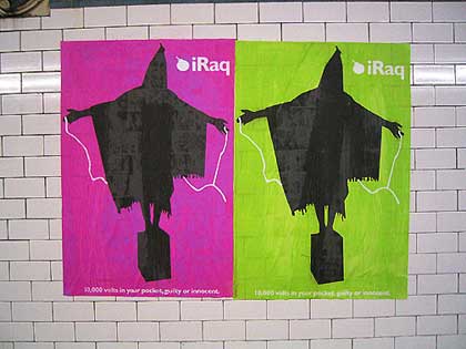
German poster designer Uwe Loeche uses the simplest and fewest elements to make his points without labouring them. The real meaning is hidden slightly, such as the poster above, placing the name of an atomic bomb that was dropped on

Another work by Uwe Lesch, the billboard designed to expose the usage of the Internet by neo Nazis to spread propaganda. “scheisse” means, shit. The image Hitler, altered to a shaved head and a www mustache that represents the internet, to visually connect the Internet to neo-facist activity, hitting the right target.

The campaign for Barnado’s cleverly show us the method of “shockvertising’, where the future 20 year old will be a victim of drug abuse. The sight of a baby attempting to “recharge” shocks our senses and we know that it is very wrong and we need to do something about it.
It seems that we accept the horror when they play with our emotions. Sometimes it is much more effective by using design than a thousand people rally, holding signs and screaming slogans.
“Everybody stand back and goes aaaaaaaaaaaaaaaaaaaaa”
Don’t have to necessary explained every word to the audience, when they are able to understand the message within the design. It could have a hidden meaning, something deep, or it could be obvious. It could be a play on the imagery or word. The point is when the message is sent across and someone is emotionally affected. That means they are aware of the problem, because they had to process all the information in order to understand what is shown.


The above series of posters is from the exhibition “Lest We Forget: Canadian Designers on War” features Canadian designers to the subject of war, antiwar and peace. They challenge the viewers to think differently and act differently as an individual.
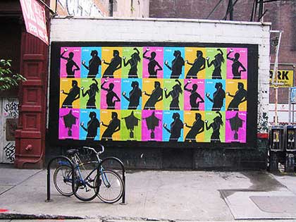
These posters playing with the name “
Conclusion
Graphic design may not be the ultimate tool, but it is a valuable media to raise public attention to different problems. It is the importance of the visual communication within graphic design, able to hit us with mass information in the simplest means. It is great for selling socks; the advertisements make us want to have that sock. We need to know how important it is to have a sock, take part in the trend or we will be mocked. The clever commercials often embed in our memory and we can find ties that deal with this sock when we are running our everyday lives. What I am trying to say is, raising public awareness over an important issue is same as selling socks, just that the sock is replaced with either a political, social and/or cultural issue.
No comments:
Post a Comment